Deprecated: ProcessWire\Pageimage::extras(): Implicitly marking parameter $value as nullable is deprecated, the explicit nullable type must be used instead in /var/www/vhosts/veravandeseyp.com/type.veravandeseyp.com/wire/core/Pageimage.php on line 1779
 Digital typography, D.E. Knuth (1999)
Deprecated: ProcessWire\MarkupQA::__construct(): Implicitly marking parameter $page as nullable is deprecated, the explicit nullable type must be used instead in /var/www/vhosts/veravandeseyp.com/type.veravandeseyp.com/wire/core/MarkupQA.php on line 74
Deprecated: ProcessWire\MarkupQA::__construct(): Implicitly marking parameter $field as nullable is deprecated, the explicit nullable type must be used instead in /var/www/vhosts/veravandeseyp.com/type.veravandeseyp.com/wire/core/MarkupQA.php on line 74
Deprecated: ProcessWire\MarkupQA::findLinks(): Implicitly marking parameter $page as nullable is deprecated, the explicit nullable type must be used instead in /var/www/vhosts/veravandeseyp.com/type.veravandeseyp.com/wire/core/MarkupQA.php on line 623
Needs
Why do we need to consider using AI for automation in type design? The most commonly mentioned reasons were simply being quicker, outsourcing tedious tasks, and empowering individual designers.
Designing typefaces can take a long time, even though the range between the quickest and slowest typeface produced by the interviewees is extremely wide. The quickest typefaces in the mix are definitely designed by Alex Slobzheninov, a type designer with Pangram Pangram who organizes a yearly symposium for experimental type design, Inscript. He challenged himself to design an entirely new typeface for 36 days in a row. But, he mentions, “... ‘the whole typeface’ was merely a circus trick.” None of them were ready to use yet; they only consisted of basic A-z characters without any kerning. They were meant as an exercise to come up with ideas quickly.
In the experience of Kai Bernau, a type designer at Atelier Carvalho Bernau and tutor at the type design master at ECAL, it can take a team of three type designers around a year to finish a good typeface family. Their typeface Lyon took four years to complete, and they have been working on a project that started over six years ago.
However, specific parts of the process should be automated, but not everything. “Once you've drawn the first 40 to 60 characters out of a thousand or so, the fun decreases somewhat.” Bernau wishes that AI could help with the annoying parts that he doesn’t want to manually repeat a million times. He doesn’t want to have to constantly ensure things are consistent, which takes an incredible amount of time that could benefit from a visual Copilot. However, he mentions that it should not automatically create things for us.
A typeface is a system governed by the relationships between characters, creating a coherent set of glyphs.
— R. Hunter Middleton
Bernau’s wish is in line with Unger’s definitions of a typeface’s quality: it should still be aesthetically original, and fulfill social legibility and expressivity. A work of quality is hard to automate, since it misses a concept and the care of a professional. Designer Tra Giang Nguyen (Gydient) adds to this that as people, we have limited time, experience, health, and other resources. These limitations shape our originality and authenticity. That influences the authenticity of the things we make.
Could we automate tedious type processes somehow? Marc Schütz, graphic designer and co-founder of Schultzschultz, says “I think faster than I can type. AI helps for my work to keep up with my thoughts.” Talia Cotton argues “[AI] gets rid of the tedium and helps us [be] really fast.” Can we somehow connect these AI for parts of the type design process that take a long time? How would that change the role of the designer?
When asked which parts of the type design process take the most time, the following aspects are frequently mentioned:
- Designing different weights and going back and forth between them
- Designing for different languages
- Kerning and spacing
- Lettering
Multiple people, including Daniel Wenzel, type designer and technologist at DIA studio, suggest that automation and scripting is already a common part of the type design industry. Alex Slobzheninov mentions that he has noticed that writing scripts have become an essential part of the type design workflow. “Coding comes with a famous quirk though—why spend a whole hour doing something manually, if you can spend just a day automating it?”
Type designer, writer and artist Charlotte Rohde says “I need a personal assistant who is better at type design than me, faster than me, and cheaper than me.” She mentions this comes from an increasing capitalist pressure, where individual type designers are not always able to produce typefaces as efficiently as a whole type design team. And we just established that efficiency is not synonymous with quality. By empowering individual designers, we can create a space for more quality typefaces to be designed.
In the long run, we could use an assistant, like “Clippy” for type design and lettering.
History of Type and Automation
 Gutenberg Press, ca. 1440
Automation starts with moveable type in the West. Johannes Gutenberg's invention of the printing press around 1440 was a significant turning point in the automation of text production and was the beginning of Latin type design. This technology made printed materials more accessible, allowing information and ideas to spread more quickly than written scripts ever could. The script evolved to suit this new approach, too, leading to typefaces becoming a system of metal type in various fonts that could be typeset into words, pages, and books [Seddon 2015].
The earliest found moveable type is from before 1377 in South Korea by Buddhist monk Baegun [Norman 2015]. It was used to print the Jikji, an anthology of Buddha’s teachings, just like Gutenberg was printing the bible.

In the process of inventing the printing press and printing the Bible, Gutenberg also created the first (Latin) typeface. It was inspired by the handwritten Blackletter script that was common in Germany then. While the familiarity of this letter likely helped make Gutenberg’s Bible such a big hit, the shape of the Blackletter did not necessarily work well for typesetting. The letters bled out way too much on the page. Soon enough, a new print typeface format was designed: the Roman serif. Possibly the first Roman typeface, Subiaco, was created by the duo Weyhnheym and Pannartz after Italian humanistic scripts in about 1465. This printed way better, as the letter shapes were lighter [Barrett-Forrest 2013].
 Gutenberg’s Blackletter, Textura, ca. 1440
 Weynheym and Pannartz; Subiaco, 1465 (top rows); Rome, 1467 (bottom rows
 Feliciano in ~1460
 Torniello in 1517
 Albrecht Dürer in 1525
 Geofroy Tory in 1529
 French Commission under Jaugeon in 1690
Around the same time that typesetting became more systemized, type design also lent itself to mathematical exploration. Typographic designs around that era were often based on custom grids that helped create precise and consistent letterforms. It was the early Renaissance, and everyone wanted to apply mathematics to anything. Calligrapher Felice Feliciano was the first to construct (only) capital letters with a ruler and a compass in approximately 1460. He wanted to root his calligraphy knowledge on a sound mathematical foundation. A fellow Italian calligrapher, Francesco Torniello, followed this trend in 1517, as well as Giovanbattista Palatino in 1550.
 Albrecht Dürer, Underweysung der Messung (1525)
Similar approaches to type design appeared in neighboring countries not too long after. Albrecht Dürer’s instruction manual about geometry for painters, Underweysung der Messung, included typographic designs. French type designer Geofroy Tory published a design in Champ Fleury while he was the first royal printer and also introduced accented letters to the French written language. More than a hundred years later, a whole team worked on the final form of this Renaissance mathematical approach, for the Royal Alphabet commissioned by Louis XIV [Knuth 1979].
 Geofroy Tory, Champ Fleury (1529)
Even though the principle of grid-based design systems still lives in design today, the glyphs designed in that era are generally not appreciated, with comments ranging from “ugly” to “deprived of calligraphic grace” [Anderson 1971]. Contemporary Giovan Cresci, who was a scribe at the Catican, wrote in 1560:
“I have come to the conclusion that if Euclid, the prince of geometry, returned to this world of ours, he would never find that the curves of the letters could be constructed by means of circles made with compasses.”
—Essemplare de piv sorti lettere, Cresci (1560) [Knuth 1979]
Luckily, our knowledge of mathematics has advanced since the Renaissance.
While not for typesetting, the Plaque Découpée Universelle (PDU) marked another step towards the standardization of typography. Invented in 1876 by American engineer Joseph A. David, the PDU was a patented stencil system whereby all letterforms: letters, numbers, and punctuation, could be traced from a single grid. Tracing combinations of lines was a systematic approach to reproducing consistent letterforms by hand [Martins et al. 2018]. It reflected the thinking of the industrial era and found widespread use in industrial applications.
You can download the stencil file below here if you want to try making letters with it yourself. pdu.svg
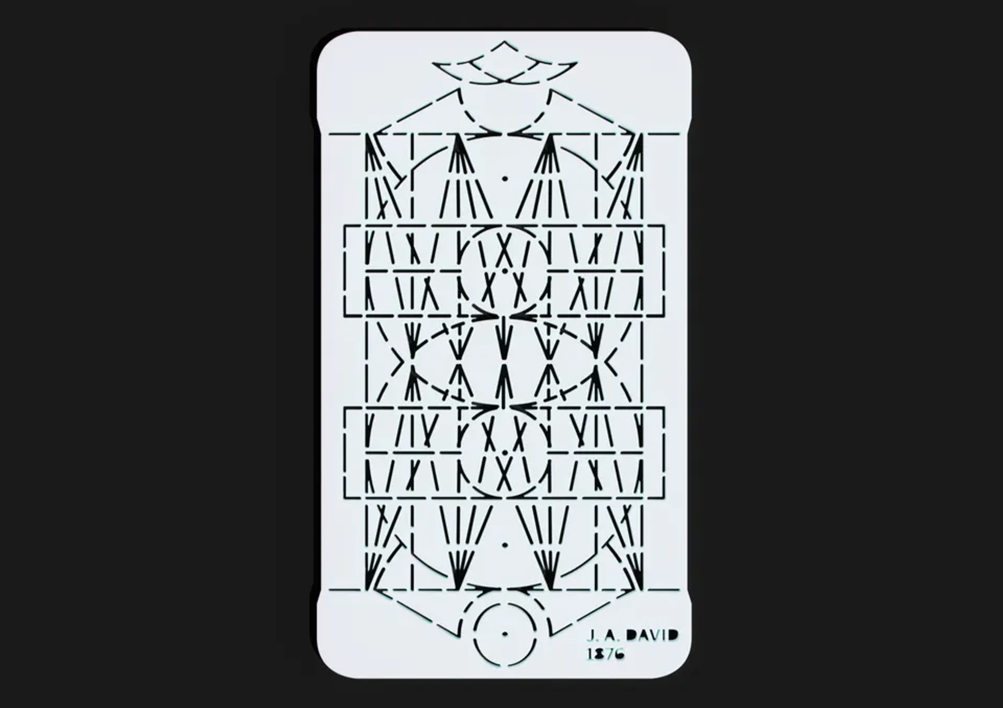 Plaque Découpée Universelle, 1876 (reproduction via Printables)
“Typography is a good model for observing perception because, with its strict rules, it creates an artificial laboratory-like workspace that everyone has within his or her reach.”
—Gerrit Noordzij, The Stroke: Theory of Writing, 2005
With the invention of the computer, the tools available to type designers changed radically. The Hershey Fonts by Allen Vincent Hershey marks the first step in computational typography. The Hershey Fonts are a collection of vector-based digital typefaces created in the 1960s. These fonts are designed for use with early computer graphics systems and proposed a significant shift in how typography could be created and rendered using computational methods.
 Hershey Format of the letter H, A. V. Hershey (1967)
These fonts are not just limited to a static format; they allow for dynamic manipulation and transformation through coordinates. This introduction of vector-based fonts marked a significant step in the evolution of digital typography [Griesshammer 2016]. Take, for example, the code for the letter H:
` 8 9MWOMOV RUMUV ROQUQ`
Each character is comprised of a sequence of letters and numbers. The first four characters are an index number, the next three numbers are the number of vertices, then the left and right width of the character to its center drawing point, followed by a sequence of letters and numbers that define the coordinates. Split into two, the first character is the X-position, the second one the Y-position, all relative in their ASCII value to the letter R. The R means ‘pen up’, so start a new line [Bourke 1997].
 In Calligraphy for Computers, A. V. Hershey (1967)
As a first step towards the digitization of typeset fonts, Peter Karow designed a type design software program called IKARUS in 1975. It converts existing typefaces into a digital font format. A print of a single character of approximately 10 cm is scanned in and converted to anchor points: beginning, corner, tangent, and curve: the same ones we can see in fonts today. He continued developing IKARUS and received a patent for the further developed concept in 1986 [Norman 2015].
Donald Knuth's 1979 Metafont was a milestone in type design software in which typefaces could be designed directly. Metafont lets the user create typefaces or other shapes through mathematical equations. It also allowed designers to generate fonts programmatically, providing them with computational control over typographic design [Knuth 1979]. At the Digital Typography project at Stanford, Knuth’s student Pijush Ghosh also tested it successfully on Indian scripts [Ghosh 1983].
 Visible Language Magazine, D.E. Knuth (1982)
Another occurrence around this time was the use of mathematical principles to design lettering. Designer and polymath Jurriaan Schrofer's work is an excellent example of such an approach. “A computer designer before the computer” because his designs were drawn by hand [Huygen 2013]. His approach often involved using grids and geometric shapes to push the boundaries of letterforms. He sometimes made an entire typeface—one of which he called Sans serious—but that was generally not his purpose. “Is it necessary”, he wrote, “to make complete alphabets with upper- and lowercase, figures, diacritics and seriously adorned with a name, when the aim is merely a formal investigation into basic recipes.”
 Nederland 15c, Jurriaan Schrofer, © Nederlands Archief Grafisch Ontwerpers
Enter the desktop computer paradigm, which changed the way we view typefaces as well as automation in the process. Without any prior knowledge of typefaces or computers, design icon Susan Kare made the first icons and typefaces for the Macintosh computer in 1983. Yet, the pixel-based paradigm was not new to her: she could easily draw from her experience working with embroidery and mosaics [Crockett 2018].
Meanwhile, computer software continued to get smarter and more automated. In 1984, Adobe released a font format called PostScript, developed by John Warnock and Charles Gerschke. It included support for hinting, which helped render complex shapes at low resolution—or very high ones. They had originally worked on this project at Xerox PARC, as part of an encoded printer output system [Norman 2015].
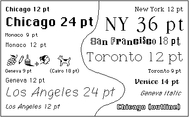 Susan Kare
Languages other than Latin faced some issues at being digitized. In 1988, a group of Xerox and Apple employees led by Joe Becker proposed a system for a multilingual character encoding system. Unicode aims to support all the world’s writing systems on the computer [Norman 2015]. The current version contains almost 150.000 characters and 161 scripts—including Egyptian hieroglyphs and emoji! Unicode is not concerned with type design, viewing it as a mere implementation choice, but it is extremely helpful in designing scripts. Only a handful of typefaces in the world are ‘pan-Unicode’, attempting to cover all fonts [Bigelow and Holmes 1993].
The Type Cube by typographer and type designer Gerrit Noordzij (1985) explores the dimensionality of letterforms. Before this cube, type designers could use two axes to lay out the spectrum of a letter in increments, such as weight from bold to thin and contrast from low to high. The concept of the Type Cube adds an extra axis for an extra parameter of the letterform, creating a theoretical three-dimensional space. In his cube, Noordzij used the axes for weight, contrast, and translation to expansion, which refers to the type of contrast. As a conceptual object, the cube inspired modern interpolation tools and parametric typography [Van Blokland 2019].
 Type Cube, Gerrit Noorzij (animated by Just van Rossum)
Generative forms became a possibility keenly explored in the digital realm. One of the first of its kind was the FF Beowolf typeface (1989), created by Erik van Blokland and Just van Rossum. This typeface used a random algorithm to change the shapes of the characters a little bit each time it was printed, making each version of the font slightly different and deteriorating the typeface over time [MoMA 2011].
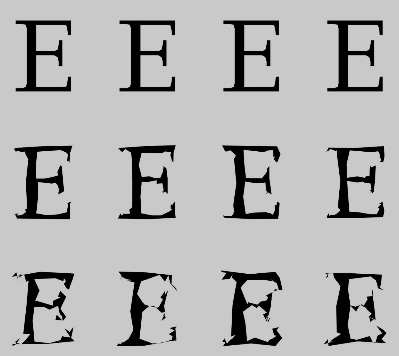 FF Beowolf, Erik van Blokland & Just van Rossum (1990)
In 1991, two font formats were released: Apple’s TrueType and Adobe’s Multiple Master fonts. The first fonts in TrueType are some of the classics: Times New Roman, Helvetica, and Courier [Dubberly 2020].
In order to support non-Latin languages better, more specific character schemes arose as well in the mid–to late 90s, such as Mojikyō, including nearly 175.000 characters in Chinese, Japanese, Korean and Vietnamese. Next to contemporary characters, it contains ancient scripts such as the oracle bone and seal script, and is the only character coding to encode many characters. Unicode often uses its data as a starting point. Next to the character set, Mojikyō later on also published software and TrueType fonts [Norman 2015].
 Mojikyō interface
Most recently, the variable font format was released in 2016 as an extension of OpenType. This font standard allows a single typeface to have parameters by containing multiple masters between which any version can be exported. This flexibility is great for dynamic media like websites and animations [Dubberly 2020].
Contemporaries
“Now is the time to figure out what the strengths of AI are and how we can use it in a good way without losing quality in illustration, quality in photography, or typography and graphic design.”
— Marc Schütz, Schultzschultz, 2024
After going down that type and automation rabbit hole, you might think we find ourselves in an improbable small niche, but the contrary is true! In the past years, many attempts have been made at using (generative) AI for the automation of typographic processes
Wang et al. have developed a tool called DeepVecFont, which generates vector suggestions based on a subset of characters as input [Wang and Lian 2021]. Rhoden used this technology to create a Glyphs 3 plugin called Glyph-o-Matic [Braga Rhoden 2023]. Chacón et al. created GANSta, a user interface that lets users use GAN to design things such as fonts and logos [Chacón et al. 2022]. Around the same time, yours truly analyzed what GANs could do by letting it recreate album covers—it turned out it was not great at lettering [Van de Seyp 2020].
As multiple designers suggested, automation and scripting is already a common part of the type design industry. The computer-aided kerning tool iKern by Igino Marini is already an industry standard for automating kerning. This is not open software, the type designer sends their unkerned font for Marini to run the engineering, sending back a kerned version. Font Remix Tools are some examples of the automation that is possible in software like Glyphs and FontLab.
Experiments
ChatGPT is very good at speeding up tedious processes. However, it will not give you a brilliant, amazing design.
—Talia Cotton, Lunch Lectures: Computational Typography (2023)
How will the role of “designers” be defined in 10 years? Can we automate tedious type design processes that normally take a long time?
A0: Autocomplete
What if it was possible to autocomplete unfinished typefaces? This could drastically reduce the tediousness that can come with designing type, so more time can be spent on the interesting and creative parts. It could also reduce the time spent on finishing a typeface, and empower smaller agencies with more limited budgets to create type.
In 2024, it is possible to use generative AI models to predict and generate the remaining characters based on a few initial inputs. I am curious to see what embedding such a tool in a type design process looks like. Throughout this section, I use Wang and Lian’s DeepVecFont 1.0 to experiment with the autocompletion of typefaces. As a database, they use a subset of the SVG-Fonts Dataset developed for SVG-VAE by Lopes et al. in 2019: The original dataset is around 14 million typefaces, and their selection is around 8.000 typefaces.
The DeepVecFont process requires a bit more setup than some other AI used in this project, especially on the Apple MacBook that is used in developing these experiments. Consequentially, this experiment is currently divided into three steps. The first step is a web-based drawing interface that can be used to draw or edit glyphs in a font. The second step happens in the command line and generates the missing characters in the font using DeepVecFont. The final step loads this vector data back into web-based interface, where each character can be modified. A future goal is to eventually turn these three separate components into one smooth process.
The web-based drawing interface is a lightweight drawing tool. The main interface is divided into two sections: a drawing part and an overview of all the glyphs. Currently, it’s just all upper- and lowercase characters. The drawing panel lets you draw straight lines and bézier curves, with a snapping function. You can adjust these by dragging the anchor point or the curve controls. Points can be deleted individually, or you can clear the entire letter. In settings, you can set basic information like the typeface name, emsperunit, and metric lines like ascender, descender, and x-height. These metrics will show up as helplines with a snapping function. For accessibility's sake, it is also possible to load an existing font file (.ttf or .otf) and work from there. All these functionalities are simplified versions of features and paradigms present existing type design software.
 The interface
A relatively novel addition is the ‘generate’ button. It sends the current state of your font to a Python Flask script that circumvents the “Save As” browser dialog that comes with a usual download and saves it as a .ttf font file directly in the folder with the DeepVecFont code. In the future, this generate button should run the next two steps automatically.
The generation of missing characters works on a few-shot generation with DeepVecFont, in which you feed a few glyphs to a pre-trained model, which in turn generates the rest of the alphabet [Wang and Lian 2021]. Deepvecfont runs in a local Python environment and turns the drawn characters of the downloaded .ttf file into .sfd files containing some basic glyph information, makes pixel images of each of them, and compresses all of this information into one .pkl file. The few-shot generation is executed on this file, either with or without refinement, which returns a vector file for each of the missing characters.


In the few-shot generation by Wang and Lian, the characters A, B, a, and b are given as input. We learned from type design that it worked even better with characters from each of the basic shape groups, like n, o and v [Cheng 2005].

The generated vector files are loaded into the same browser interface as .svgs for each character. These shapes are directly editable in the browser interface. The font file can be exported at any given moment and then uploaded again for a new design session at another moment.

Even in its current three-step state, autocompleting typefaces could have one or more functions. First of all, it could serve to generate a ‘preview’ when testing designs on words that contain to-be-designed characters. It could also function as a soundboard; where the autocomplete function might generate unexpected visual approaches that can inspire the font or stylistic alternatives. These can be updated over time as more letters are designed. While it is now running on upper- and lowercase letters, another potential application could be the beginning point of the conversion of typefaces to other languages. For this, the DeepVecFont model would need to be trained on complete sets with those languages, given it is now only trained on Latin letters.
In general, these implementations have one thing in common: they are speeding up the type design process. While this should not be about making typefaces mindlessly yet quickly, it can hopefully help divest time to the creative and enjoyable parts of the type design process, and reimagine the role of the type designer to have more space for creative design.
A preview of the generator
A1: Smart calligraphy
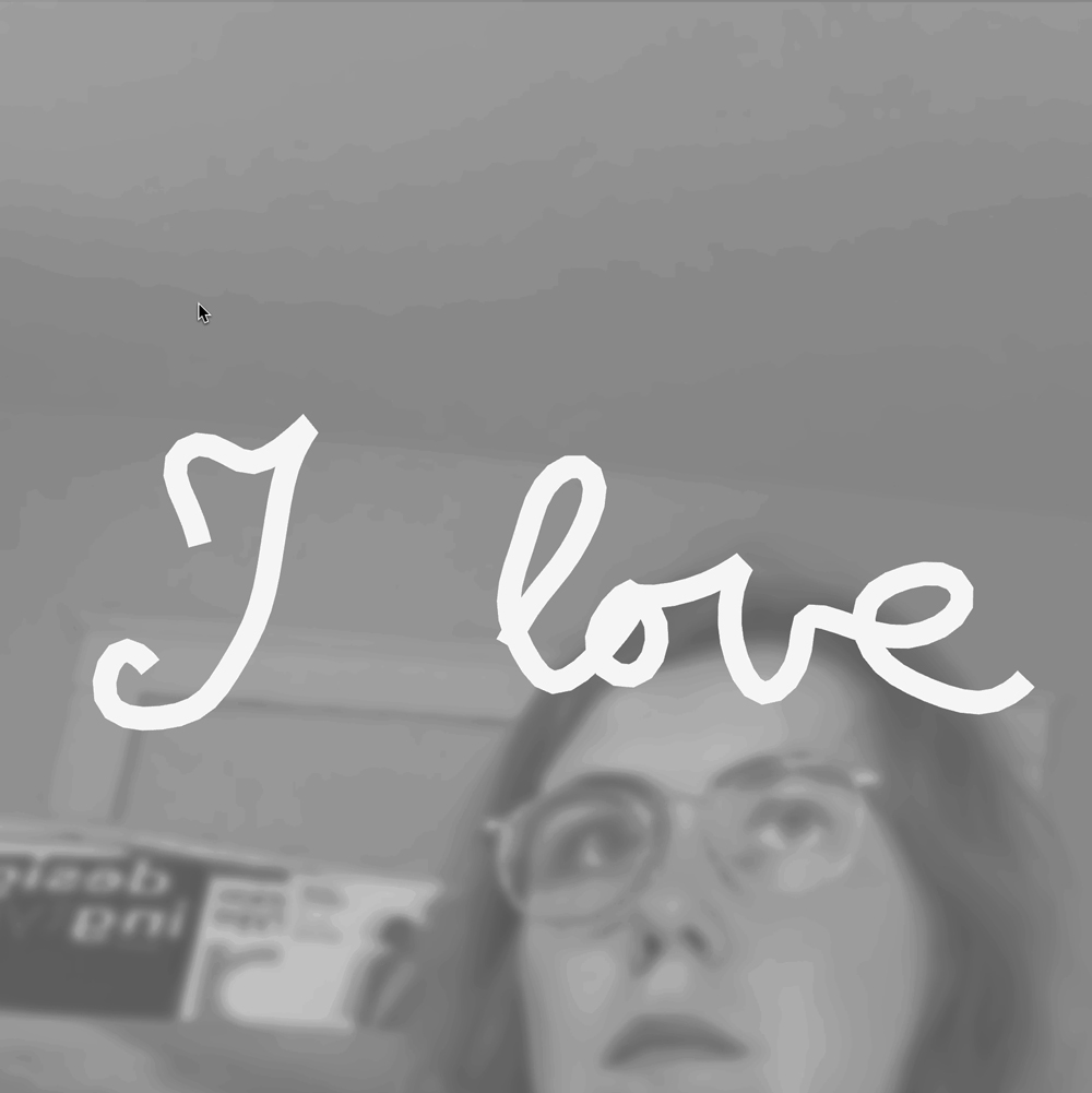
Initially, I developed this experiment as part of experiment B, as a calligraphy writer building upon the p5-to-mediapipe pipeline by Golan Levin. The experiment lets the user use custom moving brushes to draw calligraphy, letters, or anything else you want. The interaction is based on a pinch movement that is mapped to the scale of the hand by retrieving the largest distance of the lines between the base of the hand, the base of the thumb, and the base of the pinkie finger.

 The finger pinch works from different distances

Different brush sizes can be selected, and set at an angle with different color hues, using a custom GLSL shader example by Zach Lieberman. This shader is applied to any filled graphics drawn on a p5.js canvas, so when connected to the pose estimation, it’s connected to the line that is drawn while pinching. Properties can be passed to the shader like the x and y position of the line, time, and general hue. The shape is influenced by the p5.js graphics that are drawn.

 Different brush treatments

Then, the user can export the lettering as an animation or static image, with or without the camera background. This allows the user to draw colorful lettering and typographic characters with hand gestures. One can make lettering animations, practice calligraphy, or make sketches for color fonts.
However, I realized pretty quickly that, even though I used to practice calligraphy by hand for years, my skills had completely vanished. I attempted to teach myself setting up a template of a script to practice with, but to no avail.

Around the same time, I developed a Hershey fonts typewriter in p5.js to design title slides and to better understand the design of its coordinate system as explained in Typographic systems. Although the code for this was custom-made, the p5.js Hershey Vector Font Library written by computational artist Lingdong Huang served as a useful reference. It took a moment to unpack this system into p5.js, but once working it helped make monolinear typographic animations. Because it was set in p5.js, I could also apply the same shader brushes that I had developed for the calligraphy tool.
I could merge these two even further, into something that would help me be a better calligraphy writer. Google has an open-source handwriting recognition library, for which networking researcher Chen-Yu Ho wrote a Javascript API called Handwriting.js. This API was called on the drawings that I was producing with my gesture calligraphy tool and was able to recognize (at least to a reasonable degree) my scribbles as text. Handwriting recognition can be called at any time. I chose to call it whenever a scribble that’s long enough is made.
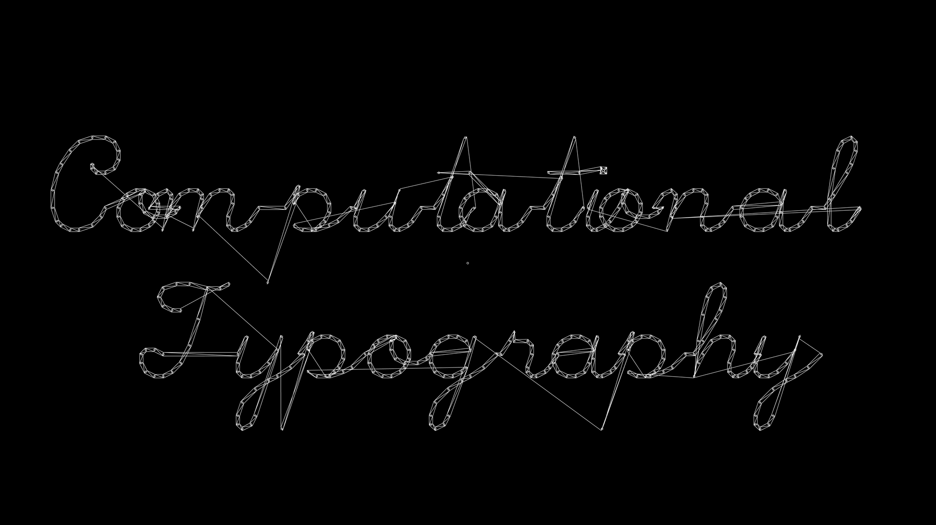

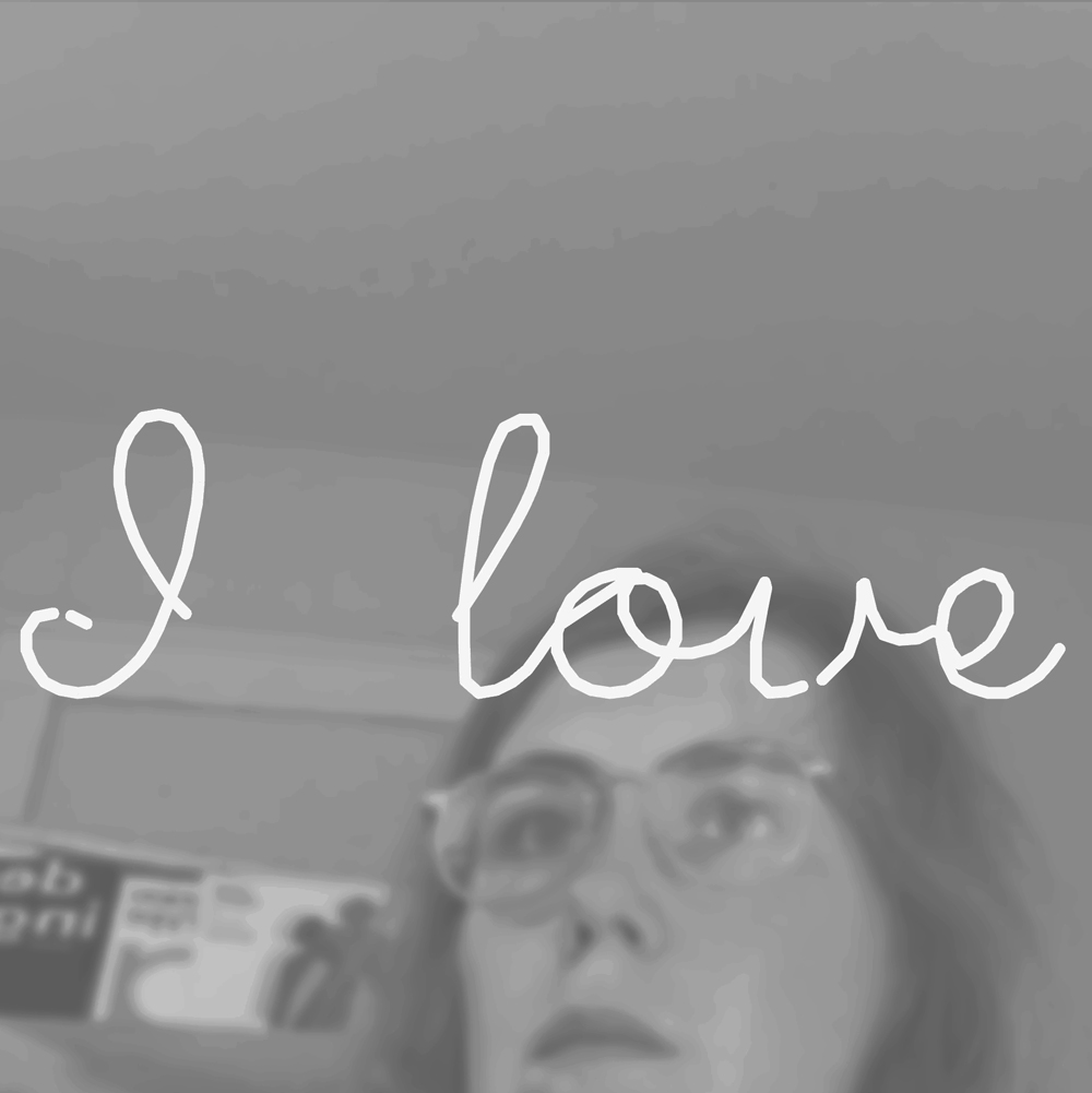
Of course, the conversion of this text can then be set to any other font. Since this calligraphy was done with a single line, it made sense to test it with Hershey’s Script Simplex font.
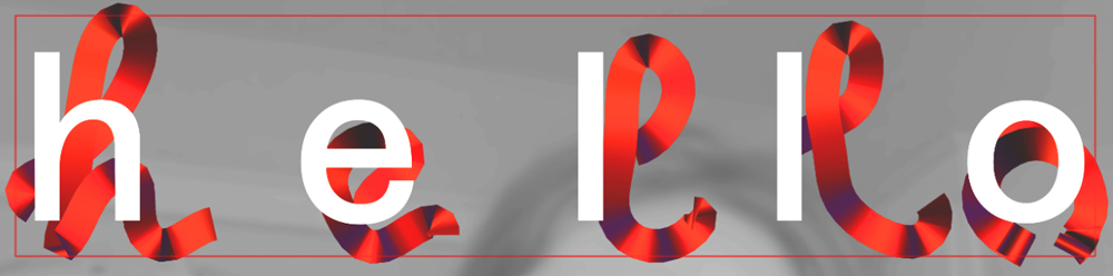
After this, the brushes and functionality of the original calligraphy tools were reapplied. While this font now just transforms to Hershey’s Simplex Script, it could transform to other single-line fonts in the future too. Of course, automating this lettering is somewhat on the more playful side of the spectrum than being a useful tool. But I see potential in the conversion from handwriting to other scripts. For instance, you it could be possible to live translate your handwriting, help with kerning and spacing of lettering, or creating animations and motion graphics.